Adding crucial context to accessible colour contrast
My Roles
UX/UI Design
Visual Design
Team
Engineer
sr brand manager
Visual Designer
TLDR
We made a colour contrast checker that was easier for designers and developers to understand if they were achieving compliant contrast levels, and get further context into how colour contrast effects their users.
The team approached this in two phases, one initial test, and a follow up edit during a website transition.
01
Metric text
01
Metric text
01
Metric text
Overview
AudioEye is an accessibility service platform that offers enterprise compliance and custom fixes for web accessibility issues. They aim to provide tools for web designers and developers to make accessibility a non-negotiable in early design stages.
Making colour contrast checking accessible & tangible
We developed a web colour contrast checker that’s accessible for non-sighted and AT (assistive technology) users, and offered further info and context for whether colour combinations were WCAG compliant. To boot, we added crucial context to help users understand how colour contrast impacts their compliance.
Problem
Research
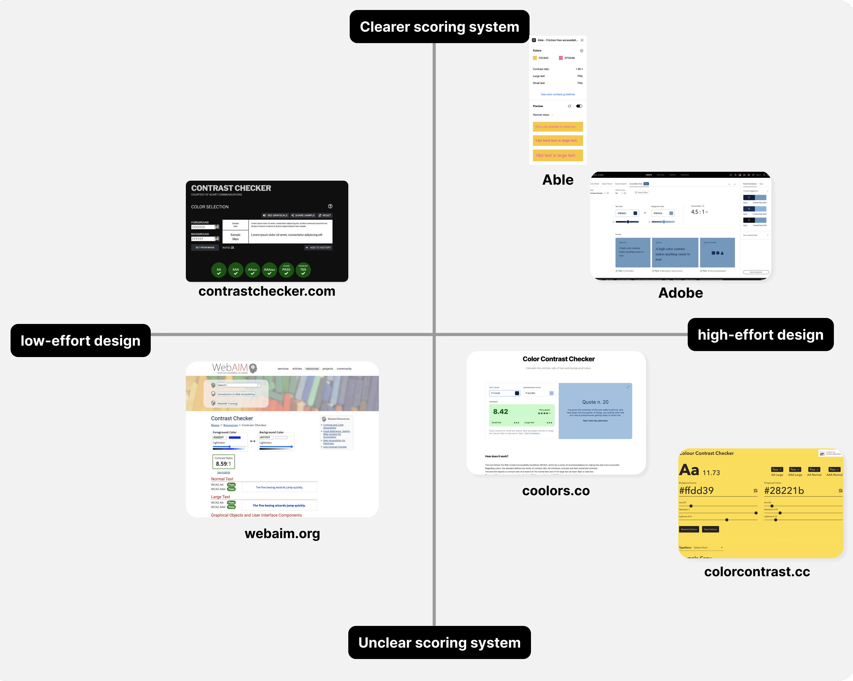
We sourced the 6 most popular colour contrast checking tools, focusing on web based tools, with 1 figma plugin. We knew our first version would be a web based tool to aid in SEO, but are hoping to continue with a figma plugin and a chrome extension for better in-context use in the future.
We found that most tools lack a clear explanation of what a certain colour contrast ratio meant. While they all graded ratios accurately, many designers (myself included previously) don’t understand what large or small text actually mean in application
Our Goals
After a competitive analysis, speaking to designers and web developers, and getting clearer guidelines on resources, we aligned on these goals:
01
Provide context for understanding requirements for AA and AAA compliance surrounding text size, iconography, and ui elements.
01
Visualize as much as possible to avoid using confusing terminology that designers outside the accessibility space may not be familiar with.
01
Include a share function to help other stakeholders understand the designers’ decisions regarding accessibility.
Explorations
We wanted to display the information in the clearest way possible in an effort to educate on accessibility methods requirements, while also acting as a useful tool.
Main challenges:
01
Differentiating properly between AA and AAA compliance
01
Avoiding cognitive overload with too much information on the screen

Colour contrast checker version 1 — Too similar to other tools, the star system is confusing, and far too much copy in the example section

The vertical scale fits nicely and would be ideal for mobile - but not a likely use case for our users, and is harder to read.

Nearly there, but the star system is unclear, and the large text vs small text is confusing
Our Launched Product
Our most successful designs covered our goals:
We launched with this layout after prototype testing, peer review, and feedback from external designers on their use case. We’ve also recently reached out to design instructors for feedback from students learning about accessibility, and are hoping to learn more about what areas are still needing more distilled and clearer presentation on what contrast accessibility looks like.

Full passing score

Version 2 in 2025 - updated post brand refresh with updates to contextual info, removed the sliding ratio scale
Ad Strategy
We wanted to push designers to question their designs. As many designers (myself included) do, we seek inspiration everywhere on the web–and what to avoid. Why not create an eye catching series of almost annoyingly bad ads that have terrible contrast, to draw attention to the issue. We sought to keep it simple, with just enough detail to instil curiosity.
We used popular colour combinations seen on more trendy advertisements (think spotify wrapped 2021) and demonstrated the slight change in hue needed to boost legibility for all.
Poor contrast — the problem
Corrected hue — the fix
Takeaway
This project was a wonderful opportunity to investigate the disconnect we are seeing between web creators (designers & developers) and web accessibility guidelines. Though much of the web is still inaccessible for much of the population due to disability, we see a push from designers, to educate and solve these issues within their own work. A major issue stems from lack of education, confusing legal jargon, and lack of web resources. We hope to see more data come over the next few months to track repeat users, and follow up with instructors on how we might make this tool more effective.